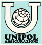
Unipol Assicurazioni’s first brand depicted the letter “U” with a globe inside, symbolizing the image of a company rooted in the values of cooperation and the world of work.
In 1989, the Unipol Group brand was born to identify all the business activities and companies within it, not just Unipol Assicurazioni. The Group’s brand was drawn from the original Unipol Assicurazioni brand, with the addition of a solid green segment identifying the Company and symbolizing its solidity. It would later also identify the other Group companies using a different colour scheme.
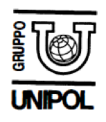
In 2000, the Group underwent a rebranding, with the U being shaped in a more modern style for the times and set within segments that, while continuing to convey a sense of cohesion and solidity, were open at the corners to symbolize openness to other business sectors and to society more generally. The Insurance Company’s brand remained green, while blue was used for the other large company that had recently joined the Group, Unipol Banca.
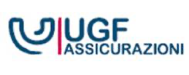
Following the acquisition of several insurance companies, including Aurora Assicurazioni, in the early 2000s, the Group’s corporate reorganization project was completed in September 2007 with the creation of UGF (Unipol Gruppo Finanziario), a holding company controlling all companies and business activities. The logo recalled the Group’s previous brand, softening and modernizing the stylization and introducing an orange colour scheme, which, along with green, indicated the main insurance divisions of UGF Assicurazioni, Unipol, and Aurora.

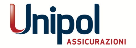
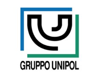
In 2011, both UGF and UGF Assicurazioni were renamed Unipol Gruppo and Unipol Assicurazioni, with the latter brand encompassing all insurance divisions. The logos were given a modern makeover with the U remaining the brand’s defining and distinctive element, although no longer a pictogram standing on its own.
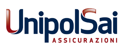
In 2014, Unipol Assicurazioni merged with Fondiaria Sai. The logo identifying the new insurance company retained Unipol’s font and colour scheme, but added the suffix “Sai” to symbolize and highlight the union of two different worlds merging together.
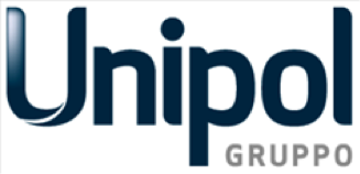
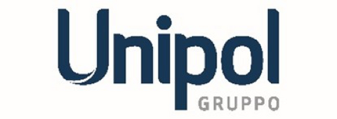
In 2017, the logos lost the colour gradient in the letter “U” in favour of a fuller, more modern colour scheme reflecting the evolution and innovation of the Group’s activities.
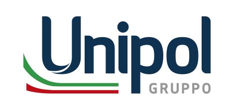
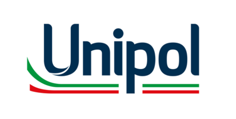
In 2020, at the height of the Coronavirus health emergency, Unipol decided to emphasize both its pride in being an Italian enterprise and the Group’s support for this country by incorporating a tricolour ribbon with the colours of the Italian flag into its logo.
In 2025, Unipol Assicurazioni was born following the merger between the holding company Unipol Gruppo and UnipolSai Assicurazioni. The logo continued to use the same colour scheme and font, but dropped the word “Group” and extended the tricolour ribbon across the entire brand, emphasizing Unipol’s increasingly deep roots within the Italian society.